Demo build log — React (UnclaimedProperty.com)
What this is. A step-by-step account of rebuilding the UnclaimedProperty.com waitlist page with the Neumo design system in React, using an AI assistant (Claude Code) driving the neumo MCP server and the Figma toolkit along the way. It documents the prompts, the tools called at each step, the code produced, and the Playwright snapshots used to iterate toward pixel-parity with the Figma design.
Follow it top-to-bottom to reproduce the build yourself. The finished app lives at
examples/react-unclaimed-property.▶ View the live demo — the finished page, hosted.
The setup
| Target design | Figma UnclaimedProperty.com → unclaimedproperty-homepage (node-id=4-5610) |
| Framework | React (Vite + TypeScript) |
| Design system | @kofile/gds-react components + @kofile/gds-foundations tokens |
| Icons | @phosphor-icons/react |
| AI tooling | Claude Code + neumo MCP server (real component APIs, tokens, audits) + Figma MCP / neumo-toolkit (read the design) + Playwright (screenshot + diff loop) |
| Sibling demos | .NET and Vue build the same page with the web components (@kofile/gds-wc) |
The point of three demos: one design, one set of tokens, three idiomatic implementations. React uses the real React components; .NET and Vue use the framework-agnostic web components.
Step 0 — Read the target from Figma
Prompt: "Rebuild this interface — unclaimedproperty-homepage, node 4-5610."
First, the connection. Reading a design into code requires a live Figma↔code link. We use the Neumo Toolkit +
figma-console-mcpbridge — set it up once via Connect Figma to code before this step.
Reading the frame (through the Figma connection) pulled it as a PNG to build against — the design intent:
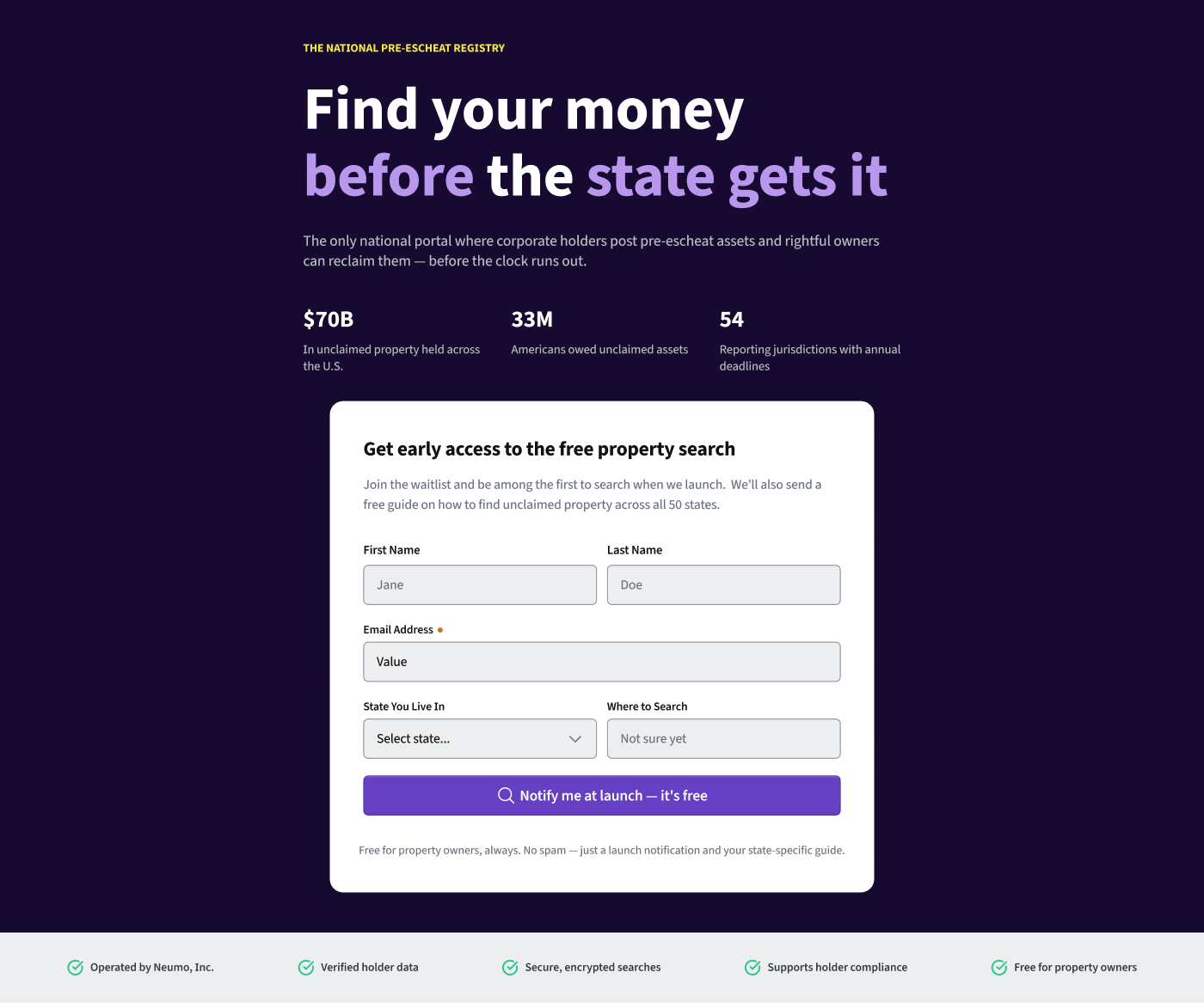
The page is a dark hero (eyebrow → two-line headline with purple accent words → lede → three stats), a white signup card (name row, email with a required marker, state-select + where-to-search row, a primary button with a magnifying-glass icon, fine print), and a light trust-bar footer with five green check items.
The
.NETdemo already rebuilt this exact frame, so itsIndex.cshtml+site.cssare a reference blueprint — the copy and structure are shared so all three demos match.
Step 1 — Learn the real component API (don't guess)
Prompt: "What's the real gds-react API for Input, Select, Button, Label?"
Tool used — the codebase + (for consumers) the neumo MCP server
(get-component, get-usage-example). The key finding that shapes the whole
build:
- gds-react is styled via CSS Modules. You import a component's stylesheet
from
@kofile/gds-foundations/components/<name>.module.cssand applyclassName={styles.root}. Without it the component renders unstyled. Inputis compound:<Input><Input.TextField /></Input>.Selectis a Radix compound —Select.Trigger/Select.Portal/Select.Content/Select.SingleMenu/Select.SingleMenuItem— noticeably more markup than the web component's<neumo-select><neumo-option>. This is the clearest React-vs-WC contrast in the build.
Step 2 — Scaffold the app
Prompt: "Scaffold a Vite + React + TS app consuming the real published packages."
Created examples/react-unclaimed-property/:
package.json—@kofile/gds-react,@kofile/gds-foundations,@phosphor-icons/react+ Vite/React/TS.src/main.tsx— the single foundational import:@kofile/gds-foundations/themes.src/App.tsx— first cut of the interface using the real components.src/app.css— the marketing layout (dark hero, stats, card, trust footer) on foundation tokens, mirroring the .NET demo'ssite.css.
Private-package note: installing requires an npm token (the packages went private). Documented in the npm access token guide.
Step 3 — Pixel-match loop
Prompt: "Run it, screenshot with Playwright, and diff against the Figma frame."
Pass 1 — first render
npm install (the private packages resolve via the npm token) → npm run dev
→ Playwright screenshot at the Figma frame width (1440px). The first render came
up strikingly close — hero, stats, white card, form, button, and trust footer
all in place, no runtime errors (the compound Input/Select usage worked).
Two defects vs. the target:
- Headline wrapped to three lines ("it" dropped onto its own line) — the 72px size overflowed the 720px column.
- Colors were placeholder literals (marked
TODO-tokeninapp.css).
Fixing color drift with the MCP server
Tool used — neumo MCP server (suggest-token) on each brand color:
| Input hex | Result | Applied |
|---|---|---|
#1b1035 (hero bg) |
--color-primary-1000, Δ7.81 → use-token |
--hero-bg: var(--color-primary-1000) |
| accent purple | picked from the primary ramp (get-tokens) |
--accent: var(--color-primary-400) |
#f2c94c (eyebrow) |
nearest Δ33 → create-token (no real match) | kept as a literal + flagged |
That eyebrow result is a genuine finding: the "sunflower" gold has no close token in the current palette — a create-token candidate for the DS team, not a mistake in the demo.
Pass 2 — parity
Dropped the headline to 60px and applied the tokens. Re-screenshot → parity:
the headline sits on two lines exactly like Figma, the accent words render in the
real --color-primary-400, and the hero surface is --color-primary-1000. Form
controls, button, and footer already matched from Pass 1.
Pass 3 — align every token, not just colors
The first passes fixed colors, but the CSS was still full of hardcoded pixels
(padding: 40px, gap: 24px, border-radius: 20px, …). If the system has a
token for a value, the demo should use it — otherwise the "design system" isn't
really being used. So every dimension went through the MCP too:
audit-tokenson the color declarations → confirmed#ffffffis a direct-match (--color-neutral-lightest) and re-flagged the sunflower eyebrow as a no-match.get-tokens category:spacingandget-tokens query:radius→ the real scales to map against.
Most spacing mapped cleanly:
| Hardcoded | Token |
|---|---|
| 64 / 48 / 24 / 20 / 16 / 12 / 8 / 4 px | --spacing-4xl / 3xl / xl / lg / md / sm / xs / 2xs |
#ffffff surfaces |
--color-neutral-lightest |
What the audit surfaced as create-token recommendations — real gaps, not
demo mistakes (kept as flagged NO-TOKEN literals):
| Value | Why it's flagged |
|---|---|
#f2c94c sunflower eyebrow |
no color token within range |
20px card radius |
the radius scale maxes at xl = 16px |
40px, 28px, 6px spacings |
fall between scale steps (32↔48, 24↔32, 4↔8) |
These are the ones to feed back to the DS team — the card radius in particular
recurs across marketing surfaces and is a good candidate for a radius-2xl.
Pass 4 — typography
The dimensions were done, but the type was still hardcoded (font-size: 60px,
font-weight: 720, line-height: 1.5, letter-spacing). audit-typography
covers exactly this — family, size, weight, line-height, letter-spacing —
bucketing each as on-scale / off-scale-near / off-scale-far / wrong-family.
Aligned:
| Hardcoded | Token |
|---|---|
| font-family literal | --font-families-default |
| 13 / 14 / 15 / 18 / 24 / 48 px | --font-size-2xs / xs / sm / lg / 2xl / 5xl |
| 30px stat value | --font-size-3xl (nearest, 28px) |
| 700 / 720 weight | --font-weights-bold (720) |
| −0.02em title tracking | --letter-spacing-3xl (near) |
More create-token gaps:
| Value | Why |
|---|---|
| 60px display headline | between font-size 5xl (48) and 6xl (72) — no display step |
| ratio line-heights (1.05 / 1.4 / 1.5) | DS line-height tokens are absolute px, not unitless ratios |
| 0.08em uppercase tracking | DS letter-spacing tokens are all negative (tightening) |
The re-render is pixel-identical (tokens resolve to the same values) but the CSS is now token-driven — color, spacing, radius, and type:
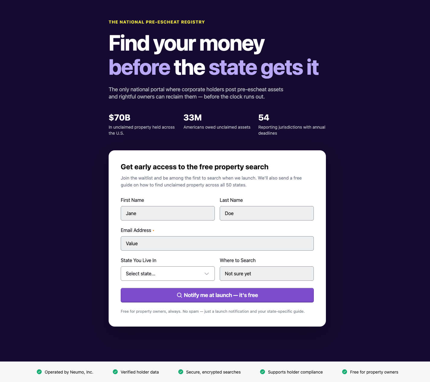
Result: the React implementation matches the Figma frame and is built on real design tokens — color, spacing, radius, and typography all resolved through the MCP, with the handful of genuine gaps surfaced as create-token recommendations rather than silently hardcoded.
Pass 5 — design review, and reading the design's actual tokens
A review pass caught real drift: the headline looked smaller and its tracking tighter than Figma, the intro paragraph's line length was too short, and the button's icon + label were left-aligned instead of centered.
Instead of eyeballing, I pulled the design's variable bindings with the Figma
MCP (get_variable_defs on the frame). That was the turning point — the Figma
file is fully tokenized, and it revealed that several earlier "gaps" were just
me sampling a screenshot instead of reading what the design actually references:
| I had | The design actually uses | Fix |
|---|---|---|
title 60px + letter-spacing-3xl |
size-6xl-bold → 72px / line-height 80px / letter-spacing-6xl |
use the 6xl ramp — title now spans the copy column |
| ratio line-heights, flagged "no token" | the absolute px line-height tokens (--line-heights-6xl=80, -lg=24, …) |
use the px line-height tokens |
eyebrow #f2c94c, flagged "create-token" |
brand/neumo-sunflower = #efe745 (a real token) |
use the sunflower value |
lede max-width: 46ch (too narrow) |
the wider copy-column measure | widen so it wraps like the design (2 lines) |
| button content start-aligned | centered icon + label | justify-content: center |
Correction to Passes 3–4: the "create-token" list shrank. The display
headline size (72px = font-size-6xl), the sunflower eyebrow
(brand/neumo-sunflower), and unitless-vs-px line-heights were not gaps — the
tokens exist; I hadn't found them by sampling pixels. The genuinely-missing tokens
that remain: the 20px card radius (scale maxes at 16), the 40/28px
spacings, and the positive uppercase tracking on the eyebrow.
The lesson (the real point of the demo): to align to a design system,
read the design's token bindings — don't sample the render. A screenshot tells
you a color is "close to purple-400"; get_variable_defs tells you the design
is bound to color/primary/400, and to the 6xl type ramp, and to
brand/neumo-sunflower. The second is ground truth; the first invents false gaps.
Pass 6 — a DS bug the demo caught: input placeholder color
Design QA flagged the input placeholders as far too dark. This one isn't the demo's CSS — it's the gds-react Input component:
.input::placeholder { color: var(--color-neutral-darkest); }               /* light mode */
.input[data-mode="dark"]::placeholder { color: var(--color-neutral-400); } /* dark mode */
In light mode (correct for the white card) placeholders paint in
--color-neutral-darkest (#121212) — the same near-black as entered text, so a
placeholder is indistinguishable from a typed value. Dark mode already uses the
muted --color-neutral-400; light mode should too.
The demo uses the component correctly, so the real fix is upstream
(packages/react-bundle input styles: light-mode ::placeholder → a muted
neutral like --color-neutral-500). Until that ships, the demo scopes a one-line
override to match the design. This is the demo doing its job — same as surfacing
the neumo-select empty menu and the token gaps.
The prompt — a reusable token-alignment loop
The token pass above isn't ad-hoc; it's a repeatable prompt worth keeping. A condensed version:
Rebuild this Figma frame in <framework> using the Neumo design system. As you go:

1. Read the design with the Figma MCP: get_screenshot for the visual, AND
   get_variable_defs to read the design's ACTUAL token bindings (colors, type
   ramps, spacing). Align to those bindings — do not sample colors/sizes off the
   rendered screenshot; that invents false "gaps."
2. After each change, screenshot the running app with Playwright and compare it
   to the frame. Iterate until they match.
3. Before finishing, run every hardcoded value through the neumo MCP server:
     • audit-tokens / suggest-token for colors
     • audit-typography for type (family, size, weight, line-height, tracking)
     • get-tokens (spacing, radius, …) for dimensions
   For each value that has a design-system token, use the token. For a value
   with no exact match, use the nearest token — UNLESS that would visibly change
   the design, in which case keep the literal and flag it as a create-token
   recommendation. Call out any value that recurs; those are the strongest
   candidates to add back to the system.
   Only tokenizable properties (color, spacing, gap, radius, typography) — not
   layout-only CSS (flex/grid/position).
MCP enhancement worth building: today step 3 is a few calls (
audit-tokensis colors-only; spacing/radius areget-tokens+ manual mapping). A singleaudit-dimensionstool that scans a stylesheet for hardcoded spacing / radius / gap and returns nearest-token + create-token recommendations — the wayaudit-tokensdoes for color — would make this one call. Good follow-up for the MCP server.
Where the MCP server + Figma toolkit show up
- Figma MCP / neumo-toolkit — Step 0 (
get_screenshotto read the frame) and Pass 5 (get_variable_defsto read the design's real token bindings — the fix for aligning to tokens instead of sampled pixels). - neumo MCP server — Step 1 (real component APIs + usage), Step 3
(
audit-tokens+audit-typography+suggest-token+get-tokensto align color, spacing, radius, and type to real tokens and surface create-token gaps).