Demo build log — Vue (UnclaimedProperty.com)
What this is. A step-by-step account of rebuilding the UnclaimedProperty.com waitlist page with the Neumo design system in Vue, this time consuming the framework-agnostic web components (
@kofile/gds-wc) rather than React components. It documents the prompts, the tools called at each step, the Vue-specific integration work, and the Playwright snapshots + neumo MCP audits used to confirm token alignment.The finished app lives at
examples/vue-unclaimed-property.▶ View the live demo — the finished page, hosted.
The setup
| Target design | Figma UnclaimedProperty.com → unclaimedproperty-homepage (node-id=4-5610) |
| Framework | Vue 3 (<script setup> + TypeScript) on Vite |
| Design system | @kofile/gds-wc web components + @kofile/gds-foundations tokens |
| Icons / font | @phosphor-icons/web + @fontsource-variable/source-sans-3 (bundled — no external requests) |
| AI tooling | Claude Code + neumo MCP server (audit-tokens / audit-spacing / audit-typography) + Figma toolkit (read the design) + Playwright (screenshot + diff loop) |
| Sibling demos | React (@kofile/gds-react) and .NET build the same page |
The point of three demos: one design, one set of tokens, three idiomatic
implementations. This Vue build is the web-component path — the same <neumo-*>
custom elements the .NET demo uses, driven from a Vue single-file component.
A note on the exercise. In real life you rarely rebuild the same app in another framework, so the interesting part here isn't the design work (that was settled in the React and .NET builds) — it's how you consume web components idiomatically in Vue, and confirming token alignment holds across the stack. The prompts are essentially the React ones with "Vue" swapped in; the Vue-specific findings are what this log focuses on.
Step 0 — Read the target from Figma
Prompt: "Rebuild this interface — unclaimedproperty-homepage, node 4-5610, in Vue using our web components."
First, the connection. Reading a design into code needs a live Figma↔code link — the Neumo Toolkit +
figma-console-mcpbridge. Set it up once via Connect Figma to code.
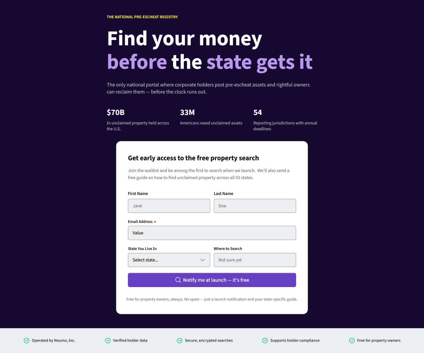
The design is the same frame the other two demos target — a dark hero (eyebrow → two-line headline with purple accent words → lede → three stats), a white signup card, and a light trust-bar footer:
Because the
.NETdemo already rebuilt this exact frame with the same web components, itsIndex.cshtmlmarkup and token-alignedsite.cssare a direct blueprint — the copy, structure, and styles are shared so all three demos match. The Vue build reuses that markup/CSS and focuses on the Vue integration.
Step 1 — Learn the real web-component API (don't guess)
Prompt: "What's the real @kofile/gds-wc API — element names, attributes,
events — for the input, select, button, label, field-message?"
Tool used — the codebase (custom-elements.json + component source), which the
neumo MCP server also exposes. The web-component contract is quite different
from the React one, and three details shape the whole Vue integration:
- Elements are
<neumo-*>custom elements withdata-*attributes:<neumo-input data-size="xl" data-alt-background>,<neumo-button data-variant="primary" data-size="xl">. A web component is just a DOM element — you read its value withelement.value, like a native input. <neumo-select>renders its menu from anoptionsproperty (an array), not from child<neumo-option>elements. This is the single most important Vue gotcha (see Step 2).<neumo-button>does not submit a form — it emits a customneumo-button-clickevent. You listen for that, notsubmit/click.
Step 2 — Scaffold the Vue app (the integration work)
Prompt: "Scaffold a Vite + Vue 3 + TS app consuming the real published
@kofile/gds-wc + @kofile/gds-foundations, latest versions, best practices."
Created examples/vue-unclaimed-property/. Four Vue-specific integration points
are worth calling out — this is the actual value of the Vue demo:
1. Tell Vue's compiler that neumo-* are custom elements (vite.config.ts) —
otherwise Vue tries to resolve them as Vue components and warns:
vue({
  template: {
    compilerOptions: { isCustomElement: (tag) => tag.startsWith("neumo-") },
  },
});
2. Register the components + tokens once, at the entry (src/main.ts):
import "@kofile/gds-foundations/themes"; // tokens (re-exports the branded theme)
import "@kofile/gds-wc";                 // side-effect: registers every <neumo-*>
There is no per-component subpath export — the single @kofile/gds-wc import
registers all elements.
3. Bind the select's options as a DOM property, not an attribute. Because
<neumo-select> reads an options array property, Vue's .prop modifier is
required — a plain :options (or child <neumo-option> tags) leaves the menu
empty:
<neumo-select :options.prop="stateOptions" placeholder="Select state..." />
4. Read values / listen for events like DOM. Vue 3.5 useTemplateRef gives the
element; .value reads it; the button's custom event binds with @:
<neumo-input ref="emailEl" @ds-input-input="clearEmailError" />
<neumo-button @neumo-button-click="onSubmit">…</neumo-button>
The layout (src/app.css) and markup are ported from the .NET demo's
token-aligned site.css — same <neumo-*> tags, same wrapper classes, so the
stylesheet is framework-agnostic and needed no Vue-specific changes.
Font + icons are bundled, not CDN-loaded (
@fontsource-variable/source-sans-3
@phosphor-icons/web), sonpm run buildproduces a fully self-containeddist/— the hosted demo makes zero external requests.
Node/tooling note: the environment runs Node 20.15, so the toolchain is Vue 3.5 + Vite 6 +
@vitejs/plugin-vue6 (Vite 7/8 require Node ≥ 20.19).
Step 3 — Pixel-match loop
Prompt: "Run it, screenshot with Playwright, and diff against the Figma frame. Then run every value through the neumo MCP server — color, spacing, typography."
Pass 1 — first render
npm install (private packages resolve via the npm token) → npm run dev →
Playwright screenshot. Because the markup + token-aligned CSS were ported from the
web-component reference, the first render came up essentially pixel-perfect —
dark hero, sunflower eyebrow, purple accent words, stats, white card with the
<neumo-*> form, primary button with the magnifying-glass icon, and the trust
footer, with no runtime errors and the isCustomElement config keeping Vue quiet.
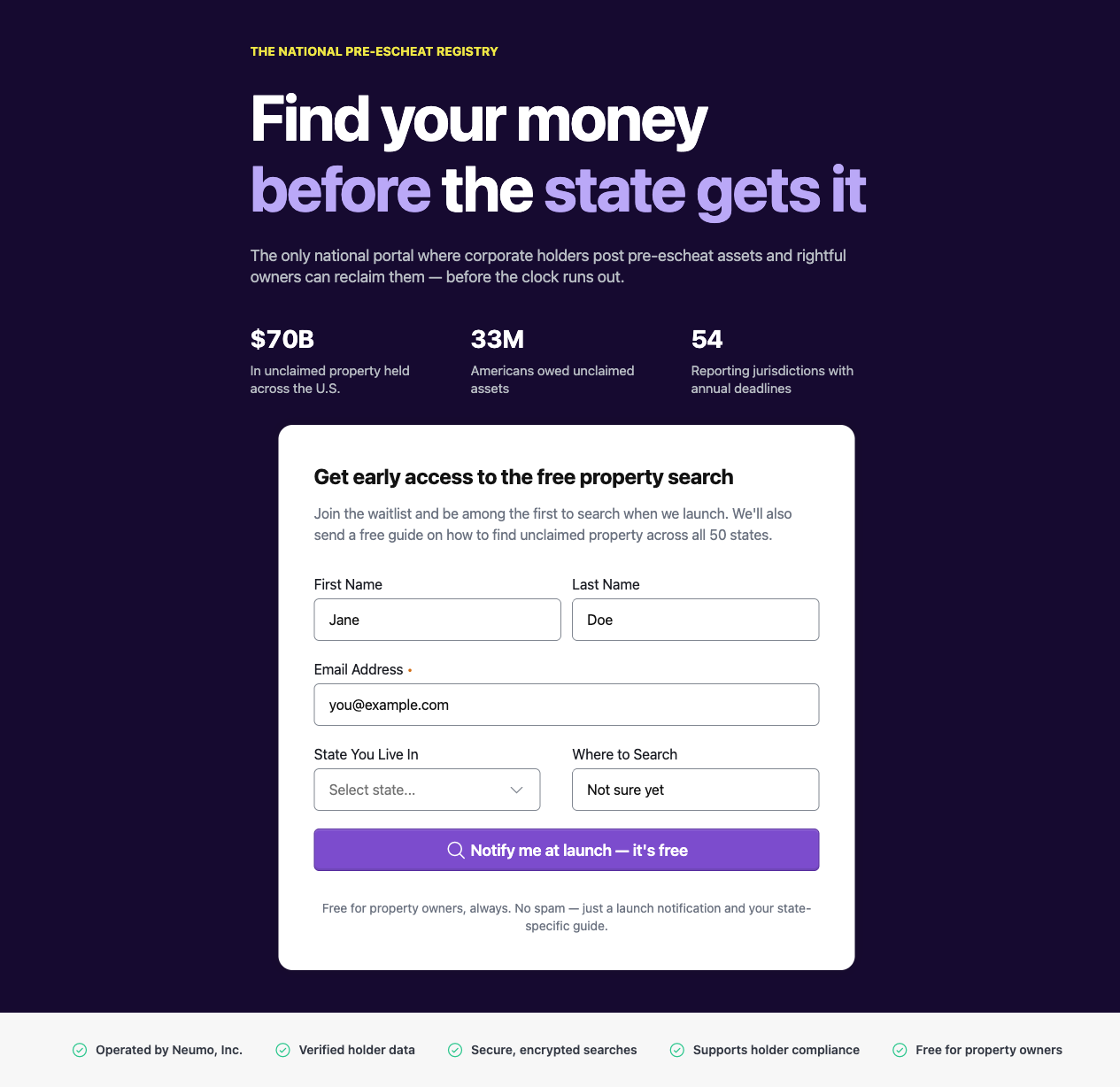
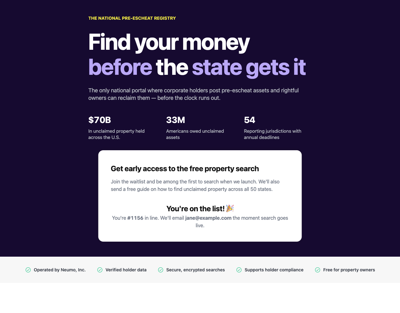
The functional integrations also verified clean: the state select populated its
6 options via :options.prop, and submitting the form (via the
neumo-button-click event) showed the success state.
Pass 2 — color
Tool used — neumo MCP audit-tokens on the stylesheet's color declarations.
Result: 18 / 18 colors aligned (uses-token, delta 0) — hero
--color-primary-1000, eyebrow --color-brand-accent, accent words
--color-primary-400, lede/stat-label --color-neutral-400, and so on. The one
raw value — the card box-shadow rgba(18,18,18,0.24) — direct-matched
--primitive-gray-black (#121212). Confirmed the resolved values in-browser via
computed styles (hero #160a30, eyebrow #efe745, title #ffffff).
Real delta found (a component gap, not a demo bug): the Figma design shows the inputs with a light-gray fill (
data-alt-background), but the rendered<neumo-input>stays white — the gray-fill CSS is gated on adata-modethe composed component doesn't propagate to its internal input. The.NETreference renders white for the same reason, so the Vue build matches the reference; the design's gray input fill is an upstream@kofile/gds-wcissue to file, not something to hack around in the demo.
Pass 3 — spacing
Tool used — neumo MCP audit-spacing. Result: 27 / 29 on tokens — every
padding / gap / margin maps to a spacing token (--spacing-2xl, -xl,
-lg, -sm, -xs, -2xs, --primitive-40/48/32/80), and the card radius
16px is on-scale (--borderRadius-xl). The only two off-scale values are the
design's literal column widths (715px hero copy, 651px card) — intentional
layout dimensions from the Figma nodes, not spacing-scale candidates.
Pass 4 — typography
The type ramp is fully tokenized (--font-size-6xl 72 / --line-heights-6xl 80
title, -3xl stat value, -2xl card title, -lg lede, -md subtitle, -sm
stat label, -xs eyebrow/fineprint/trust; --font-weights-bold/semibold/regular;
--letter-spacing-*). Verified the resolved metrics in-browser (title renders
72px / line-height 80px / weight 720 / letter-spacing −1.8px).
MCP finding (worth fixing): unlike
audit-tokensandaudit-spacing, which have auses-tokenbucket and correctly creditvar(--…)usage,audit-typographydoesn't recognizevar()token references — it buckets a fully-tokenized ramp asoff-scale-far/wrong-family. So it can't confirm a tokenized type ramp; you have to verify via computed styles. Makingaudit-typographyunderstandvar()token usage (like the other two auditors) is a good MCP follow-up.
Result: the Vue implementation matches the Figma frame and is built on real
design tokens — color, spacing, radius, and type — with alignment confirmed
through the MCP, and two genuine findings surfaced (the input data-alt-background
component gap and the audit-typography var() blind spot) rather than papered
over.
The prompt — same loop, Vue context
The token-alignment loop is the same repeatable prompt used for the React build
(read the design's real token bindings with the Figma MCP; screenshot + diff with
Playwright; run every hardcoded value through the neumo MCP — audit-tokens,
audit-spacing, audit-typography — using the token where one exists, flagging
create-token gaps where none does). See the
React build log for the full annotated version. For a
web-component rebuild the only additions are framework-integration checks:
When rebuilding in Vue with the web components, also verify:
  • isCustomElement is configured for the neumo-* prefix
  • array/object inputs use the .prop binding modifier (e.g. :options.prop)
  • custom events are wired (@neumo-button-click), values read via el.value
  • the tokens + component bundle are imported once at the entry
Then run the same audit-tokens / audit-spacing / audit-typography passes.
Where the MCP server + Figma toolkit show up
- Figma toolkit — Step 0 (read the frame as the visual target; the design's token bindings were already captured in the React/.NET builds).
- neumo MCP server — Step 1 (real component API), and the Step 3 passes:
audit-tokens(color, 18/18),audit-spacing(spacing, 27/29), andaudit-typography(which surfaced its ownvar()blind spot). - Playwright — the Pass-1 render + success-state screenshots, and the computed-style checks that confirmed colors and the type ramp resolve to the right token values.